Boom Nerthil: A Display Font That Cuts Through the Feed
It was 3 p.m. on a Tuesday—two days before launching a new online course series—and I was tweaking the final Instagram carousel. The first slide needed to stop scrollers mid-swipe: bold, confident, unmistakably *new*. I’d tried three fonts already. One felt too corporate. Another got lost on mobile. The third looked great in my desktop preview but turned muddy when I checked the actual app. Then I dropped in Boom Nerthil. Instant pause. Not because it’s loud—but because it’s clearly intentional. That’s when I knew this wasn’t just another aesthetic font. It’s a campaign tool.
A Display Font With Direction, Not Just Decor
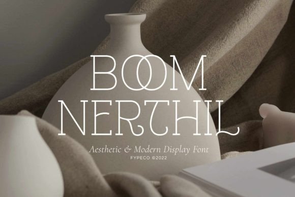
Boom Nerthil is a modern display font built for visibility and voice—not decoration alone. Its letterforms balance geometric precision with subtle warmth: clean terminals, open counters, and a slight vertical rhythm that keeps energy moving upward. It doesn’t shout; it leans in. That makes it especially effective for short-form messaging where tone matters as much as text—think “Early Access Opens Friday” or “Your First Module Is Ready.” It’s not a script font, not a serif, not a neutral sans—it occupies its own lane: contemporary, human-scaled, and quietly confident.
What sets Boom Nerthil apart in real use isn’t just how it looks at 48pt on a banner—it’s how it holds up across contexts. In YouTube thumbnails, its strong x-height and generous spacing keep headlines legible even when scaled down to 120×68 pixels. On Pinterest pins, it resists visual noise without sacrificing personality. And on Instagram Stories, where text overlays sit over motion or texture, Boom Nerthil’s alternates and ligatures add polish without clutter—like swapping a standard “ff” for a smoother connected form, or choosing a bolder “a” variant to anchor a headline.
Where It Shines (and Where to Pause)
Boom Nerthil excels in high-impact, low-text scenarios: webinar banners, email headers, product launch teasers, Reels covers, and branded template packs for creators. I used it for a limited-time shop promotion (“48 Hours Only”) layered over a dark gradient background—and the contrast held. The uppercase “O” has just enough openness; the lowercase “g” has a graceful tail that adds movement without distraction. It works beautifully on light and dark backgrounds alike, as long as you maintain at least 14px line height and avoid tight tracking below 24pt.
That said, it’s not meant for body copy, pricing tables, or multi-paragraph email footers. Its design intent is display—not utility. Trying to force it into dense layouts or tiny UI labels undermines both readability and impact. It also doesn’t replace a robust typography system: think of Boom Nerthil as your campaign’s lead speaker, not the whole team.
Smart Pairing Keeps Campaigns Cohesive
In every project where Boom Nerthil landed well, pairing was non-negotiable. I default to a clean, neutral sans serif—something like Inter, Poppins, or even a well-hinted system font—for supporting text. That contrast lets Boom Nerthil breathe while keeping hierarchy intuitive: big, bold, distinctive headline → clear, calm, readable subhead or CTA. For editorial-style quote graphics or content series, I’ve paired it with a warm serif (e.g., Lora or Literata) for body text—creating tension that feels intentional, not accidental.
One thing I always check before committing: the included alternates and ligatures. Boom Nerthil ships with stylistic sets that let you toggle between more formal and more expressive versions of letters like “a,” “e,” and “t.” In a digital ad set, I’ll use the cleaner variants for consistency across platforms; in a Reels cover pack, I’ll lean into the bolder alternates for visual variety across frames. These aren’t gimmicks—they’re practical levers for brand flexibility.
Practical Checks Before You Drop It Into Campaign Assets
Before dropping Boom Nerthil into client work, templates, or merch, I run through a quick checklist:
- Licensing: Confirm commercial use rights—especially for digital products, ads served via Meta/Google, or downloadable template bundles.
- File formats: Make sure you have both OTF and WOFF2 if using it on websites or email builders with limited font support.
- Multilingual needs: Check glyph coverage if your audience includes diacritics (e.g., French accents, Spanish ñ) or extended Latin characters—Boom Nerthil supports most common Western European languages, but verify for your use case.
- Weight options: It’s a single-weight display font—not a full family—so plan hierarchy around size, color, and spacing rather than bold/light variations.
And one last note: Boom Nerthil performs best when treated as part of a system—not a one-off flourish. In a recent content series rollout, we used it exclusively for episode titles and series branding, while keeping all captions, timestamps, and CTAs in a consistent sans serif. That repetition built recognition fast. Viewers didn’t need to read the full title—they recognized the shape of the “B” and the rhythm of the caps.
Not Every Font Needs to Be Everywhere
There’s something refreshing about a display font that knows its role. Boom Nerthil doesn’t try to be a logo font *and* a web font *and* a packaging typeface. It’s focused. That focus makes it easier to deploy consistently—and easier to explain to stakeholders why it works where it does. When your goal is clarity, confidence, and cut-through—not neutrality or universality—Boom Nerthil delivers without overpromising. It’s not magic. It’s thoughtful design, engineered for how people actually see and process messages today: fast, fragmented, and fiercely selective.